User Experience (UX) Design
“Easell” is an imagined art gallery auction app designed as part of the Google UX Design Certificate course on Coursera. After being given a prompt by Sharpen, I was asked to construct a case study for a fictional app from concept to finished design.
I decided to lean more towards an art-focused ecommerce platform that would allow local customers and artists to buy and sell pieces online. As someone who both shops for and sells arts and crafts online, I went into the user research stage thinking about what I originally looked out for when choosing a potential platform on which to create my storefront.
Following a brief competitive analysis of similar platforms such as eBay and Depop, I assumed that our target audience would be most similar to the type that shops on Etsy -- opinionated, aesthetically-driven, and eager to support small businesses.
Although in the real world, an app like this would have two distinct types of users, buyers and sellers, for the purposes of this project I chose to focus on the former, Alice (R), who would be using the app to find unique, affordable art pieces from her local community.
Project Timeline
September 2023 - November 2023
Project Role
UX research, wireframing, prototyping and design
Patricia took up painting as a creative outlet during the pandemic, and while she still enjoys her day job, she’s excited to have art as a potential side hustle. She wants to find an easy, low-effort way to sell her pieces online without worrying too much about the details.
Alice has finally graduated college and is excited to immerse herself into city life. A maximalist at heart, she’s looking forward to decorating her new apartment with all kinds of interesting pieces, but wants to make sure she’s not just “buying junk.”
Wireframes
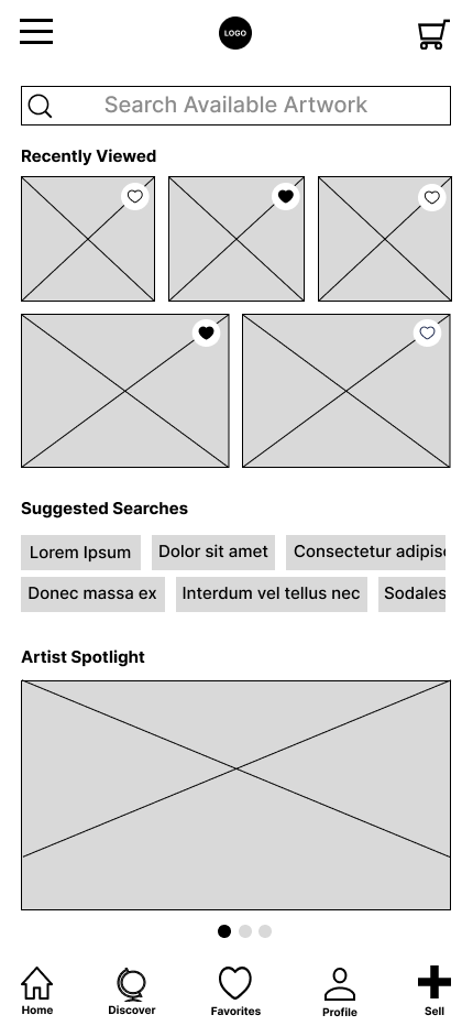
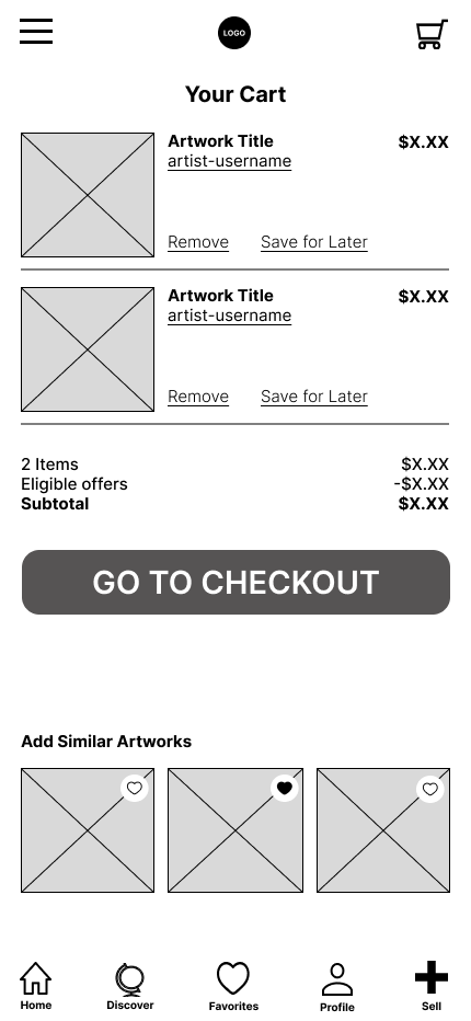
From the very beginning of the design process, I wanted to ensure that the user’s eye would be drawn to the artwork first.
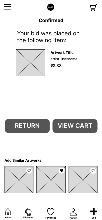
Upon converting my paper designs to digital ones, I decided to include a “artist spotlight” section that could serve as blog content to engage users, as well as “similar artwork” sections that would allow users to continue their shopping with like items.
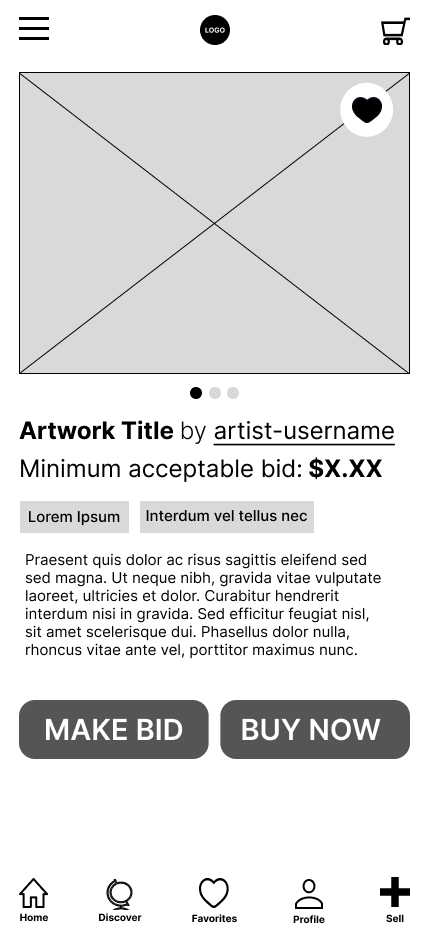
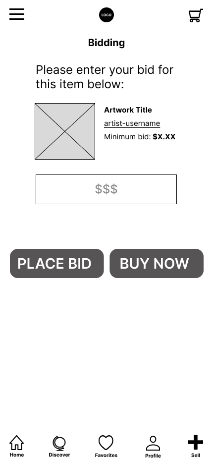
Based on feedback from my initial low fidelity prototype, I also made it clearer that the price listed on the product page was the minimum acceptable bid, and changed some of the wording to reflect that bidding is a separate function from buying.
MOCK-UPS
For my final mock-ups, I created the name “Easell” (a portmanteau of “Easel,” which is used to display paintings, and “sell”).
The color scheme consisted of dark purple and a contrasting harvest gold color for buttons; both these hues are meant to symbolize creativity, success, and luxury.
Typefaces used are Orelega One (headlines), Montserrat (paragraph), and Oleo Script Wash Caps (wordmark logo).
All elements of this project were designed Figma and can be accessed here.


